
SEHA CLINICS offers a wide range of medical specialities across multiple locations, from preventative care to advanced, specialised treatment. The challenge was not just to communicate this breadth, but to do so in a way that felt unified, human, and reassuring.
The campaign needed to introduce multiple specialities under one master idea, while still allowing each discipline to feel personal, accessible, and close to patients’ everyday lives.
We began by developing multiple umbrella campaign routes, each offering a different way to frame specialty care within the SEHA CLINICS brand.
Some routes leaned into clinical authority and scale, highlighting expertise and medical leadership. Others explored human moments and patient journeys, focusing on empathy, reassurance, and lived experience.
Each route was tested against one core question:
Can this idea hold scale across all specialities, touchpoints, and time - without fragmenting the brand?
The selected route
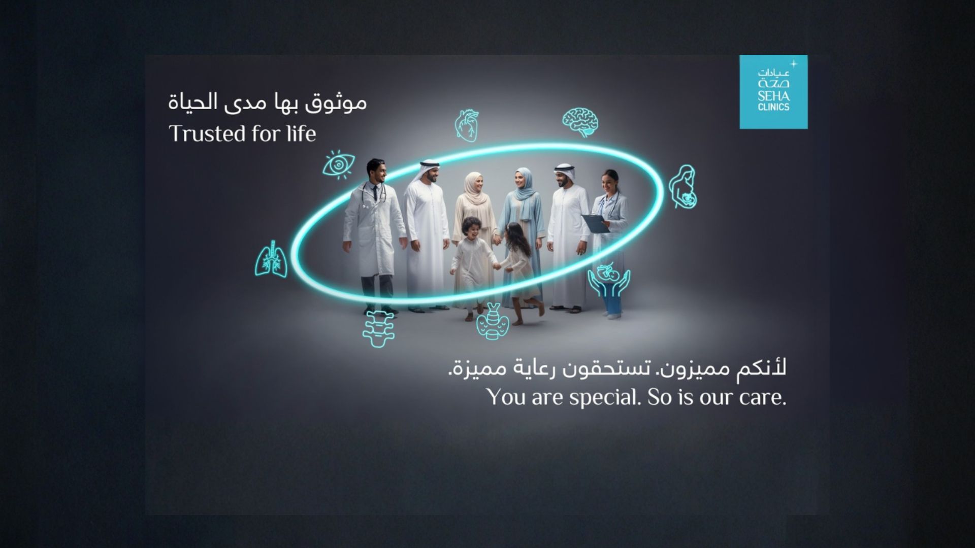
"You are special. So is our care."
This route was selected for its ability to balance medical credibility with emotional connection.
It positioned every patient as an individual, while reinforcing SEHA CLINICS’ commitment to consistent, high-quality care across all specialities.
The idea allowed every discipline, from cardiology to pediatrics, to speak with its own relevance, while remaining anchored to one clear, recognisable promise.
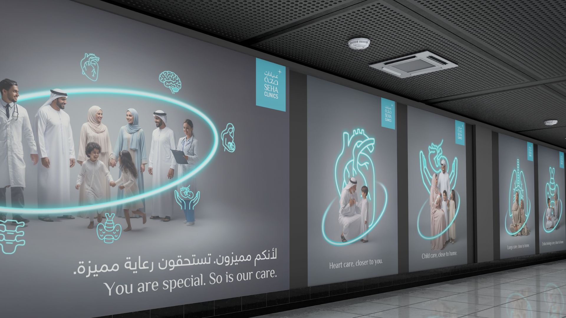
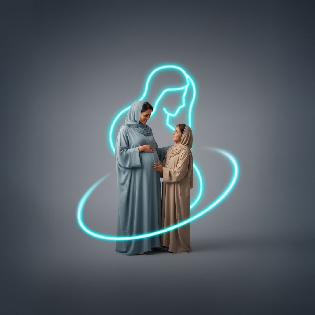
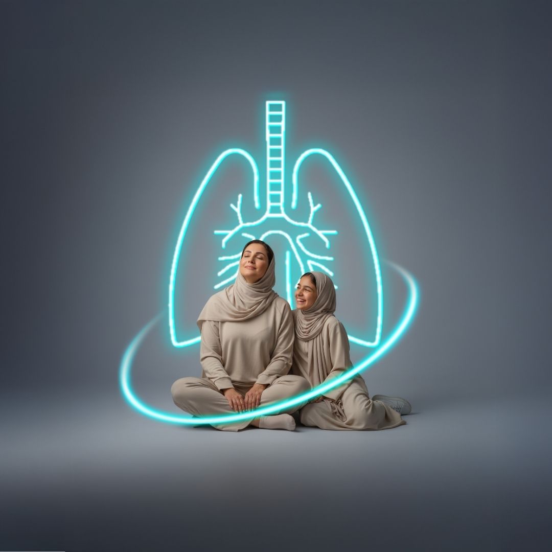
The selected route was translated into a flexible master system built around the Circle of Care — a visual representing continuity, trust, and holistic support.
Neon-glow specialty icons were introduced to bring clarity and immediacy, helping patients recognise and differentiate specialities at a glance while maintaining a cohesive visual language.
The system was adapted across:
· Master campaign key visuals
· Specialty-specific tactical executions, including clinic availability
· Patient story templates showcasing evidence of care
· Doctor-led posts introducing expertise through human presence
· Email banners and newsletters rolled out in phases, from specialty introductions to focused storytelling

.gif)