NAIA Residences: Crafting Elegance in Urban Living
NAIA Residences is a privately owned, G+2 residential development located within one of Dubai’s emerging residential zones. Designed with restraint and purpose, the project prioritises calm, functionality, and emotional comfort over visual excess.
The challenge was to translate this architectural philosophy into a brand identity that felt equally understated and intentional — capturing the building’s sense of privacy, balance, and quiet sophistication while positioning it clearly within Dubai’s competitive residential landscape.
Shaping the Brand Foundation
We were brought in at the earliest stage of the project to shape NAIA’s brand from the ground up.
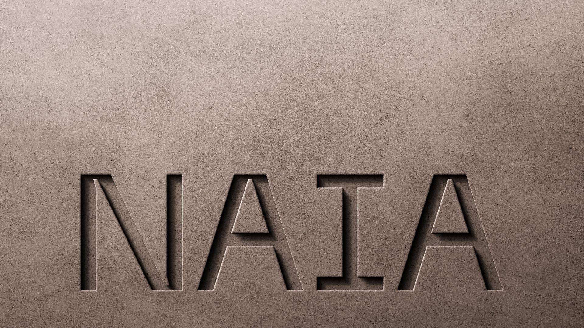
This began with defining the core idea behind the development: a residential experience rooted in flow, light, and dignified simplicity. The name NAIA was developed to reflect this ethos — drawing from nautical and aerial references to evoke openness, movement, and serenity within an urban setting.
The foundation set the tone for everything that followed, ensuring consistency between architecture, interiors, and brand expression.
The visual identity was designed to mirror the architectural language of the building itself.
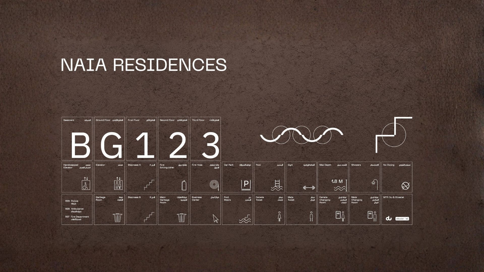
A minimalist logo system was created using subtle vertical rhythms and fluid curves, echoing the structure’s proportions and spatial flow. A restrained colour palette, paired with warm, natural accents, ensured the identity could live comfortably across both physical and digital environments.
The system was extended into:
- Internal signage and wayfinding
- Verbal identity and tone of voice
- Photography direction focused on light, materiality, and human scale
- A flexible toolkit for marketing and sales communications
Every element was designed to feel calm, cohesive, and considered — never decorative.
Beyond branding, we designed intuitive internal signage that blends seamlessly into the interiors. Typography, materials, and lighting cues were carefully considered to guide residents through shared spaces with ease and subtlety.
The identity system was applied across brochures, on-site materials, and digital touchpoints — ensuring the brand felt consistent from first impression through to lived experience.