
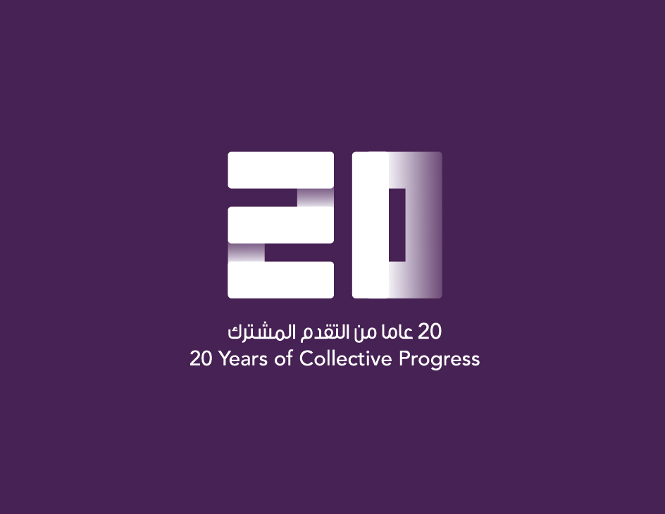
Emirates Islamic Bank | 20th Anniversary Logo
An American diner concept built from the ground up in Sharjah. We developed the full brand identity, logo, visual language and concept direction, and carried it through every touchpoint: chrome finishes, a red neon sign outside, menus, packaging and uniforms. From blank page to opening day.
Client
Emirates Islamic Bank
Location
Dubai, UAE
Scope
Commemorative logo design, brand guidelines
Role
Brand design partner
An American diner concept built from the ground up in Sharjah. We developed the full brand identity, logo, visual language and concept direction, and carried it through every touchpoint: chrome finishes, a red neon sign outside, menus, packaging and uniforms. From blank page to opening day.
Context
There was no existing brand to react against — no name, no colour direction, no local precedent for what an American diner should look like in Sharjah. Every part of the identity had to be invented, then made to hold up in a physical space.
The challenge
There was no existing brand to react against — no name, no colour direction, no local precedent for what an American diner should look like in Sharjah. Every part of the identity had to be invented, then made to hold up in a physical space.
Process
There was no existing brand to react against — no name, no colour direction, no local precedent for what an American diner should look like in Sharjah. Every part of the identity had to be invented, then made to hold up in a physical space.
Early exploration — references, mark iterations, colour tests.
Carried through every touchpoint
There was no existing brand to react against — no name, no colour direction, no local precedent for what an American diner should look like in Sharjah. Every part of the identity had to be invented, then made to hold up in a physical space.

Result
There was no existing brand to react against — no name, no colour direction, no local precedent for what an American diner should look like in Sharjah. Every part of the identity had to be invented, then made to hold up in a physical space.
What we'd carry forward
There was no existing brand to react against — no name, no colour direction, no local precedent for what an American diner should look like in Sharjah. Every part of the identity had to be invented, then made to hold up in a physical space.